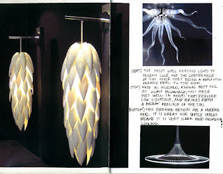


This Layout is from the magazine The English Home - August 2006
I really like this one because of how the colors tie together and how there is one main pictures of an image, but it also has sub pictures which gives more detail to the design. I also like how it has the minimum amount of words including one larger caption and a couple lesser important sentences.

No comments:
Post a Comment